Anatomised creative partner Mike Everett picks his Desert Island Ads
 Mike Everett is a writer and creative director. He began his career in earnest at Collett Dickenson Pearce in the mid-seventies, rising to board director and creative group head. He then worked as an executive creative director at both Allen Brady and Marsh and Grey Advertising in London.
Moving to Lowe International, he became the worldwide creative director on the group’s Nestlé business as well as working on other international accounts held by Lowe such as Unilever, Johnson and Johnson and HSBC Bank. Along with Mark Andrews and David Hughes he is one of the three partners of Anatomised.
Desert Island Ads
I may have got this whole Desert Island Ads malarkey wrong but I can’t see any point in choosing commercials. Presumably, the desert island would be without electricity. Which means that even if I took my laptop, I wouldn’t be able to watch the commercials once the battery ran down. So I have hatched a cunning plan. I am going to choose ten posters – but I want them to come to my desert island in their entirety – framework, backing board, supports, everything. This may sound like a lot to cart along but there’s method in my madness.
First of all, if the weather turned bad, two 48-sheets propped up against each other would make a fine shelter. And a single poster, correctly positioned, would provide an effective windbreak. (I don’t know where the island is, but I have been to the Caribbean and there’s a prevailing east wind there.) There are other advantages to taking posters to the Island.
Firstly, if I tired of desert island life, a 48-sheet poster could act as a ready-made raft. Imagine it. Floating back to Blighty perched upon Mr. Spock’s pointy ears, desperately in need of refreshment. (The ears, not me.)
Secondly, suppose I spy a passing ship. A pile of poster sites, made as they usually are, of wood, would instantly provide me with tinder for a gigantic bonfire to attract attention, followed by imminent rescue. So, ten posters it is. Here’s my choice for windbreak, raft, shelter and bonfire.
One: the aforementioned, Heineken Mr. Spock poster. There is no doubt in my mind that this was the best ever Heineken poster. Terry Lovelock wrote a script taking the mickey out of Star Trek. Tony Brignull got a brief to do a Heineken poster. Inspired by Terry’s script he thought that Mr. Spock’s ears would be a good subject. He asked Paul Smith to art direct it. Paul added the ‘illogical’ thought bubble. Nobody could track down Leonard Nimoy to take the photograph. So Alan Waldie suggested using Philip Castle to do a cartoon instead. The result? A tour-de-force and a Yellow Pencil at D&AD.

Two: ‘This much lead in this much pencil’. Richard Foster and John Horton created this poster for Parker during their stay at Collett, Dickenson and Pearce. In my view, a perfect marriage between visual and words – and another Yellow Pencil from D&AD.

Three: ‘We knew how before you-know-who’ for Rawlings Tonic Water. The late, great Ron Collins at his best. This poster, using the end line from the accompanying commercial, is so simple and typical of CDP in the seventies. Rawlings was an also-ran to Schweppes but predated them by several years. That one fact was enough to launch a memorable campaign – with Ron Collins guiding the creative tiller.

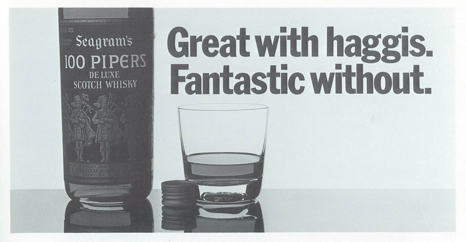
Four: ‘Great with Haggis. Fantastic without’ for 100 Pipers Scotch whisky. Tony Brignull again, this time with Neil Godfrey doing the art direction. Another example of CDP in full bloom and another also-ran product lifted to sublime perfection by a combination of wit and crystal-clear art direction. Is it any wonder that Tony and Neil were D&AD’s most-awarded writer and art director of the last 50 years?
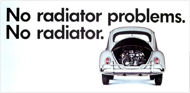
Five: ‘No radiator problems. No radiator’. There are many great examples of Volkswagen advertising but this poster from Doyle Dane Bernbach’s Los Angeles outpost is my absolute fave. A product benefit story effortlessly told in five words and one picture. There’s not even a logo, but the poster leaves little doubt as to who the advertiser is.
Six: Benson & Hedges ‘Birdcage’. Alan Waldie and Mike Cozens created this poster as part of a campaign that was designed to fox the regulators that policed tobacco advertising in the seventies. It succeeded, and spawned many more billboards that baffled and captured attention in equal measure. It’s hard these days to appreciate how revolutionary this work was when it appeared. It was the result of one of CDP’s legendary one-word creative briefs, in this case, ‘incomprehensible.’

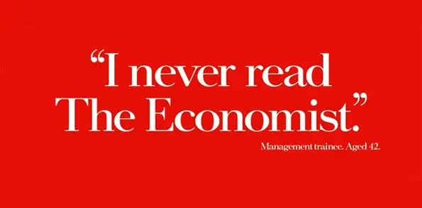
Seven: ‘I never read The Economist. Management Trainee age 42’. The late David Abbott and a man to whom I owe a lot, Ron Brown (he gave me my first writing job) created this poster at AMV. The story goes that David noticed that the Economist’s masthead had the same proportions as a 48-sheet poster, asked media director Ken New to drum up an argument for using posters instead of press, and a star campaign was born.
Eight: ‘Paint our shoes? We’d rather dye.’ For Timberland. Who says you shouldn’t use puns in headlines? Not Leagas Delaney. Another succinct example of a product benefit pared down to a few words. And a neat joke into the bargain.

Nine: ‘When was the last time a man said you had a great pair of jeans?’ for Pretty Polly tights. Joann Mond wrote this in answer to a brief for a double page spread to appear in Vogue. Frank Lowe saw the concept and decided it was too good to be tucked away in a magazine. He changed the media to 48-sheet posters. The art director was Ted Ekman, assisted by Alan Waldie. This poster proved so distracting to male drivers that it was credited with causing a spate of car crashes. Oh, and by the way, Richard Avedon took the photograph.

The one that got away
Ten: ‘Rest, keep warm, drink liquids’ for American Airlines to Hawaii. Try as I might I couldn’t find a reference to this poster. Nor could anyone else. So I will do my best to describe it. Let’s start with the brief. Imagine being asked to do a destination ad for an airline. How easy to fall into the trap of the usual beauty shot of a beach with palm trees. Not Doyle Dane Bernbach. They stick a fat geezer wearing sunglasses on a sun lounger, give him a Del Boy Trotter cocktail, and plaster him across the full length of a billboard, with a common piece of medical advice as the headline. Brilliant.
So there they are, my desert island posters. But hang on a minute. Having written about them I am not sure that burning them or pressing one into service as a raft is such a good idea. They’re all far too good. No, I don’t think I’ll go to that desert island after all. Instead I will stay snug at home, get some rest, keep warm – and drink liquids, plenty of liquids. Cheers!


