Categories
#rstats Data analysis ruminations Software Work

Same Developer, New Stack

I’ve been fortunate to work with and on open-source software this year. That has been the case for most of a decade: I began using R in 2014. I hit a few milestones this summer that got me thinking about my OSS journey.

I became a committer on the Apache Superset project. I’ve written previously about deploying Superset at work as the City of Ann Arbor’s data visualization platform. The codebase (Python and JavaScript) was totally new to me but I’ve been active in the community and helped update documentation.

Those contributions were sufficient to get me voted in as a committer on the project. It’s a nice recognition and vote of confidence but more importantly gives me tools to have a greater impact. And I’m taking baby steps toward learning Superset’s backend. Yesterday I made my first contribution to the codebase, fixing a small bug just in time for the next major release.

Superset has great momentum and a pleasant and involved (and growing!) community. It’s a great piece of software to use daily and I look forward to being a part of the project for the foreseeable future.

I used pyjanitor for the first time today. I had known of pyjanitor‘s existence for years but only from afar. It started off as a Python port of my janitor R package, then grew to encompass other functionality. My janitor is written for beginners, and that came full circle today as I, a true Python beginner, used pyjanitor to wrangle some data. That was satisfying, though I’m such a Python rookie that I struggled to import the dang package.

Categories
Data analysis Local reporting Software Work

Making the Switch to Apache Superset

This is the story of how the City of Ann Arbor adopted Apache Superset as its business intelligence (BI) platform. Superset has been a superior product for both creators and consumers of our data dashboards and saves us 94% in costs compared to our prior solution.

Background

As the City of Ann Arbor’s data analyst, I spend a lot of time building charts and dashboards in our business intelligence / data visualization platform. When I started the job in 2021, we were halfway through a contract and I used that existing software as I completed my initial data reporting projects.

After using it for a year, I was feeling its pain points. Building dashboards was a cumbersome and finicky process and my customers wanted more flexible and aesthetically-pleasing results. I began searching for something better.

Being a government entity makes software procurement tricky – we can’t just shop and buy. Our prior BI platform was obtained via a long Request for Proposals (RFP) process. This time I wanted to try out products to make sure they would perform as expected. Will it work with our data warehouse? Can we embed charts in our public-facing webpages?

The desire to try before buying led me to consider open-source options as well as products that we already had access to through existing contracts (i.e., Microsoft Power BI).

Categories
#rstats Data analysis ruminations Work

Reflections on five years of the janitor R package

One thing led to another. In early 2016, I was participating in discussions on the Twitter hashtag, a community for users of the R programming language. There, Andrew Martin and I met and realized we were both R users working in K-12 education. That chance interaction led to me attending a meeting of education data users that April in NYC.

Going through security at LaGuardia for my return flight, I chatted with Chris Haid about data science and R. Chris affirmed that I’d earned the right to call myself a “data scientist.” He also suggested that writing an R package wasn’t anything especially difficult.

My plane home that night was hours late. Fired up and with unexpected free time on my hands, I took a few little helper functions I’d written for data cleaning in R and made my initial commits in assembling them into my first software package, janitor, following Hilary Parker’s how-to guide.

That October, the janitor package was accepted to CRAN, the official public repository of R packages. I celebrated and set a goal of someday attaining 10,000 downloads.

Yesterday janitor logged its one millionth download, wildly exceeding my expectations. I thought I’d take this occasion to crunch some usage numbers and write some reflections. This post is sort of a baby book for the project, almost five years in.

By The Numbers

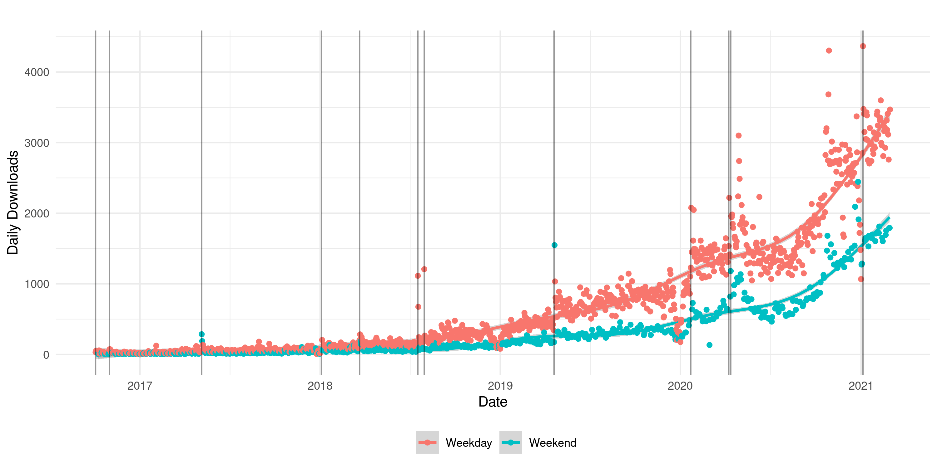
This chart shows daily downloads since the package’s first CRAN release. The upper line (red) is weekdays, the lower line (green) is weekends. Each vertical line represents a new version published on CRAN.

From the very beginning I was excited to have users, but this chart makes that exciting early usage seem miniscule. janitor’s most substantive updates were published in March 2018, April 2019, and April 2020, with it feeling more done each time, but most user adoption has occurred more recently than that. I guess I didn’t have to worry so much about breaking changes.

Another way to look at the growth is year-over-year downloads:

YearDownloadsRatio vs. Prior Year
2016-1713,284
2017-1847,3043.56x
2018-19161,4113.41x
2019-20397,3902.46x
2020-21 (~5 months)383,5956
Download counts are from the RStudio mirror, which does not represent all R user activity. That said, it’s the only available count and the standard measure of usage.
Categories
Data analysis How-to

Python Script to Retrieve SolarEdge Solar Panel Data

After having a rooftop solar array installed on my home in 2019, I wanted to analyze its actual performance and compare it to projections. In particular, we ended up with a smaller inverter (7kW) than recommended for our total panel capacity (11kW). We often experience some shading on our panels, so the inverter should not limit (or “clip”) the energy production too greatly – but I want to quantify the extent of the clipping effect.

That analysis is for later, though. Here is how I first retrieved the production data for my system from the SolarEdge API, in fifteen-minute intervals. It pulls data for both energy (watt-hours generated) and power (power production, in watts). I think the power is average power over that 15 minute period, though I don’t see that documented and it doesn’t line up exactly with energy generation. I’m a Python beginner and relied on my brother, who kindly wrote almost all of this code.

Setup: you’ll need your SolarEdge API key, which you can get by following their instructions (pp. 5-6). You’ll also need to install the solaredge Python package (and Python itself, if you haven’t used it before). In addition to an API key, the script below refers to a site ID. You can find that in the mySolarEdge app, under information about your site, or via the results of a query to the API.

Categories
Biking Data analysis Local reporting

One Year of the William St. Bikeway

A year ago, Ann Arbor opened its first protected bike lane & cycle track: the William St. Bikeway. From my individual perspective, it’s been a huge hit. My family bikes on it to reach the downtown library, NeoPapalis Pizza, and the university. I see it used by other cyclists, skateboarders, and scooter-riders, snow clearing was decent last winter, and it’s only infrequently blocked by parked cars or trucks. Car traffic on William is calm and not noticeably backed up.

Construction of the city’s next protected bike lane is well underway, on First Street. And the city experimented this fall with temporary bike lanes around downtown, some of which have been great. The Division St. Cycle Track provides a divided, protected two-way bike highway without affecting car travel and it intersects conveniently with the William St. Bikeway, opening up travel in all directions. The William St. Bikeway was the proof point that made these other installations possible.

So it improved my family’s experience biking downtown and paved the way for other infrastructure. Did it change people’s behavior? In my post last year about the Bikeway, I displayed a snapshot of the Strava cycling heatmap that I took on November 1st, 2019. I grabbed one today, November 2nd, 2020, to compare. Here’s last year (see the old post for interpretation):

Categories
Biking Data analysis

Strava traffic on William St. Bikeway

The William St. Bikeway officially opened last weekend, though it is not yet finished and is in fact entirely closed in segments as construction is finished.  Here I am with my boy at the grand opening:

Sam and son biking on the new bikeway
A street that safely accommodates my four-year-old

I realized I should grab a “before” shot of the Strava cycling heatmap so I can eventually compare it to “after.” [the hardest part of data analysis is collecting the right data].  I took this November 1st, 2019, though a week ago would have been better:

heatmap showing cycling traffic on the Strava app

In it we see that William is less popular for East/West travel than either Liberty or Washington. This might have been due to its more peripheral location at the south edge of downtown, confusing lane changes, and higher traffic speeds.  The latter two are mitigated by the protected bike lane.

Will we see traffic spike? The biggest increase in ridership will likely be in the non-Strava-using crowd, i.e., regular people.  And that will be my explanation if this heatmap looks the same a year from now.  I’m not sure if those cycling for sport will find the protected lane more appealing.  The data service Strava Metro would allow for better analysis of this question, including  looking at those rides tagged as “commutes”, but I don’t have access to that data.

Incidentally, I’m curious about the “advisory bike lane” unprotected segment between First and Fourth.  With winter approaching, I don’t expect that segment to be painted anytime soon.  An informational poster on William St. describes how it will work and it doesn’t sound like anything I have seen around Ann Arbor.

Categories
#rstats Data analysis Sports

Double check your work (Kaggle Women’s NCAA tournament 2019)

I’m writing about an attention-to-detail error immediately after realizing it.  It probably won’t matter, but if it ends up costing me a thousands-of-dollars prize, I’ll feel salty.  I thought I’d grouse in advance just in case.

The last few years I’ve entered Kaggle’s March Madness data science prediction contests.  I had a good handle on the women’s tournament last year, finishing in the top 10%.  But my prior data source – which I felt set me apart, as I scraped it myself – wasn’t available this year.  So, living my open-source values, I made a quick submission by forking a repo that a past winner shared on Kaggle and adding some noise.

Now, to win these contests – with a $25k prize purse – you need to make some bets, coding individual games as 1 or 0 to indicate 100% confidence that a team will win.  If you get it right, your prediction is perfect, generating no penalty (“log-loss”).  Get it completely wrong and the scoring rule generates a near-infinite penalty for the magnitude of your mistake – your entry is toast.

You can make two submissions, so I entered one with plain predictions – “vanilla” – and one where I spiced it up with a few hard-coded bets.  In my augmented Women’s tournament entry, I wagered that Michigan, Michigan State, and Buffalo would each win their first round games.  The odds of all three winning was was only about 10%, but if it happened, I thought that might be enough for me to finish in the money.

Michigan and Buffalo both won today!  And yet I found myself in the middle of the leaderboard.  I had a sinking feeling.  And indeed, Kaggle showed the same log-loss score for both entries, and I was horrified when I confirmed:

A comparison of my vanilla and spiced-up predictions
These should not be identical.

In case Michigan State wins tomorrow and this error ends up costing me a thousand bucks in early April, the commit in question will be my proof that I had a winning ticket and blew it.

Comment if you see the simple mistake that did me in:

Where is an AI code reviewer to suggest this doesn’t do what I thought it did?

As of this writing – 9 games in – I’m in 294th place out of 505 with a log-loss of 0.35880.  With the predictions above, I’d be in 15th place with a log-loss of 0.1953801, and ready to benefit further from my MSU prediction tomorrow.

The lesson is obvious: check my work!  I consider myself to be strong in that regard which makes this especially painful.  I could have looked closely at my code, sure, but the fundamental check would have been to plot the two prediction sets against each other.

That lesson stands, even if the Michigan State women fall tomorrow and render my daring entry, and this post, irrelevant.  I’m not sure I’ll make time for entering these competitions next year; this would be a sour note to end on.

Categories
#rstats Data analysis

Generating unique IDs using R

Here’s a function that generates a specified number of unique random IDs, of a certain length, in a reproducible way.

There are many reasons you might want a vector of unique random IDs.  In this case, I embed my unique IDs in SurveyMonkey links that I send via mail merge. This way I can control the emailing process, rather than having messages come from SurveyMonkey, but I can still identify the respondents.  If you are doing this for the same purpose, note that you first need to enable a custom variable in SurveyMonkey!  I call mine for simplicity.

The function

create_unique_ids <- function(n, seed_no = 1, char_len = 5){
  set.seed(seed_no)
  pool <- c(letters, LETTERS, 0:9)
  
  res <- character(n) # pre-allocating vector is much faster than growing it
  for(i in seq(n)){
    this_res <- paste0(sample(pool, char_len, replace = TRUE), collapse = "")
    while(this_res %in% res){ # if there was a duplicate, redo
      this_res <- paste0(sample(pool, char_len, replace = TRUE), collapse = "")
    }
      res[i] <- this_res
  }
  res
}

Here’s what you get:

> create_unique_ids(10)
 [1] "qxJ4m" "36ONd" "mkQxV" "ES9xW" "5nOhq" "xax1v" "DLElZ" "PXgSz" "YOWIG" "WbDTQ"

This function could get stuck in the while-loop if your N exceeds the number of unique permutations of alphanumeric strings of length char_len.  There are length(pool) ^ char_len permutations available.  Under the default value of char_len = 5, that’s 62^5 combinations or 916,132,832.  This should not be a problem for most users.

On reproducible randomization

The ability to set the randomization seed is to aid in reproducing the ID vector.  If you’re careful, and using version control, you should be able to retrace what you did even without setting seed.  There are downsides to setting the same seed each time too, for instance, if your input list gets shuffled and you’re now assigning already-used codes to different users.

No matter how you use this function, think carefully about how to record and reuse values such that IDs stay consistent over time.

Exporting results for mail merging

Here’s what this might look like in practice if you want to generate these IDs, then merge them into SurveyMonkey links and export for sending in a mail merge.  In the example below, I generate both English- and Spanish-language links.

roster$id <- create_unique_ids(nrow(roster), seed = 23)
roster$link_en <- paste0("https://www.research.net/r/YourSurveyName?a=", roster$id, "&lang=en")
roster$link_es <- paste0("https://www.research.net/r/YourSurveyName?a=", roster$id, "&lang=es")
readr::write_csv(roster, "data/clean/roster_to_mail.csv", na = "")

Note that I have created the custom variable a in SurveyMonkey, which is why I can say a= in the URL.

Categories
#rstats Data analysis

How to Teach Yourself R

(Or, “how to teach professionals to teach themselves R”).

Background: I taught myself R in 2014 from public web resources, and since then have steered several cohorts of data analysts at my organization through various R curricula, adapting based on their feedback.

This is geared toward people teaching themselves R outside of graduate school (I perceive graduate students to have more built-in applications and more time for learning, though I don’t speak from experience).  I say “students” below but I am referring to professionals.  This advice assumes little or no programming experience in other languages, e.g., people making the shift from Excel to R (I maintain that Excel is one of R’s chief competitors).  If you already work in say, Stata, you may face fewer frustrations (and might consider DataCamp’s modules geared specifically to folks in your situation). 

I’ve tried combinations of Coursera’s Data Science Specialization, DataCamp’s R courses, and the “R for Data Science” textbook.  Here’s what I’ve learned about learning and teaching R and what I recommend.

I see three big things that will help you learn R:

  1. A problem you really want to solve
  2. A self-study resource
  3. A coach/community to help you
Categories
#rstats Data analysis

Can a Twitter bot increase voter turnout?

Summary: in 2015 I created a Twitter bot, @AnnArborVotes (code on GitHub).  (2018 Sam says: after this project ceased I gave the Twitter handle to local civics hero Mary Morgan at A2CivCity).  I searched Twitter for 52,000 unique voter names, matching names from the Ann Arbor, MI voter rolls to Twitter accounts based nearby.  The bot then tweeted messages to a randomly-selected half of those 2,091 matched individuals, encouraging them to vote in a local primary election that is ordinarily very low-turnout.

I then examined who actually voted (a matter of public record).  There was no overall difference between the treatment and control groups. I observed a promising difference in the voting rate when looking only at active Twitter users, i.e., those who had tweeted in the month before I visited their profile. These active users only comprised 7% of my matched voters, however, and the difference in this small subgroup was not statistically significant (n = 150, voting rates of 23% vs 15%, p = 0.28).

I gave a talk summarizing the experiment at Nerd Nite Ann Arbor that is accessible to laypeople (it was at a bar and meant to be entertainment):

This video is hosted by the amazing Ann Arbor District Library – here is their page with multiple formats of this video and a summary of the talk.  Here are the slides from the talk (PDF), but they’ll make more sense with the video’s voiceover.

The full write-up:

I love the R programming language (#rstats) and wanted a side project.  I’d been curious about Twitter bots.  And I’m vexed by how low voter turnout is in local elections.  Thus, this experiment.